
Telling Stories Using Data Visualization and Information Design
Course Overview
Get the crucial data analysis and visualization skills you need for any data job. You will learn the fundamentals of Python to prepare, explore, analyze and build data visualizations. By the end, you’ll be able to convey insightful stories and help make data driven decisions.
Key Skills
- Programming with Python to manipulate data
- Using the Python libraries Pandas and NumPy for data analysis
- Using the most common data visualization techniques to explore data
- Using data visualization to convey insights and tell a story
Course Outline
Introduction to Python
Introduction to Python Programming
Lessons Objective
- Write computer programs using Python
- Save values using variables
- Process numerical data and text data
- Create lists using Python
Basic Operators and Data Structures in Python
Lessons Objective
- Use for loops to repeat processes and conduct data analysis
- Implement if, else, and elif statements in programming logic
- Employ logical and comparison operators in Python
- Develop and update Python dictionaries for data manipulation
- Construct frequency tables using dictionaries for data analytics
Python Functions and Jupyter Notebook
Lessons Objective
- Write Python functions
- Debug functions
- Define function arguments
- Write functions that return multiple variables
- Employ Jupyter notebook
- Build a portfolio project
Intermediate Python for Data Science
Lessons Objective
- Clean and analyze text data
- Define object-oriented programming in Python
- Process date and times
Data Analysis and Visualization with Python
Introduction to Pandas and NumPy for Data Analysis
Lessons Objective
- Improve your workflow using vectorized operations
- Select data by value using Boolean indexing
- Analyze data using Pandas and NumPy
Introduction to Data Visualization in Python
Lessons Objective
- Visualize time series data with line plots
- Define correlations and visualize them with scatter plots
- Visualize frequency distributions with bar plots and histograms
- Improve your exploratory data visualization workflow using pandas
- Visualize multiple variables using Seaborn’s relational plots
Telling Stories Using Data Visualization and Information Design
Lessons Objective
- Create graphs using information design principles
- Create narrative data visualization using Matplotlib
- Create visual patterns using Gestalt principles
- Control attention using pre-attentive attributes
- Empty Matplotlib’s built-in-styles
Projects in this course
Project 1. Profitable App Profiles for the App Store and Google Play Markets
For this project, you will be a data analyst at a company that builds free, ad-supported Android and iOS apps. To drive revenue, you’ll analyze real app market data to find app profiles that attract the most users
Project 2. Exploring Hacker News Posts
For this project, we’ll be data analysts exploring Hacker News posts. We’ll use Python string manipulation, OOP, and date handling to analyze trends driving post popularity. Check out our Jupyter Notebook Guided Project if needed.
Project 3. Exploring eBay Car Sales Data
For this project, we’ll assume the role of data analysts for a used car classifieds service to explore and clean a dataset of car listings from eBay Kleinanzeigen, a section of the German eBay website.
Project 4. Finding Heavy Traffic Indicators on I-94
For this project, you’ll assume the role of a data analyst exploring a dataset on westbound traffic on the I-94 Interstate highway. You’ll apply exploratory data visualization techniques to determine indicators of heavy traffic.
Project 5. Storytelling Data Visualization on Exchange Rates
For this project, we’ll assume the role of a data analyst tasked with creating an explanatory data visualization about Euro exchange rates to inform and engage an audience.
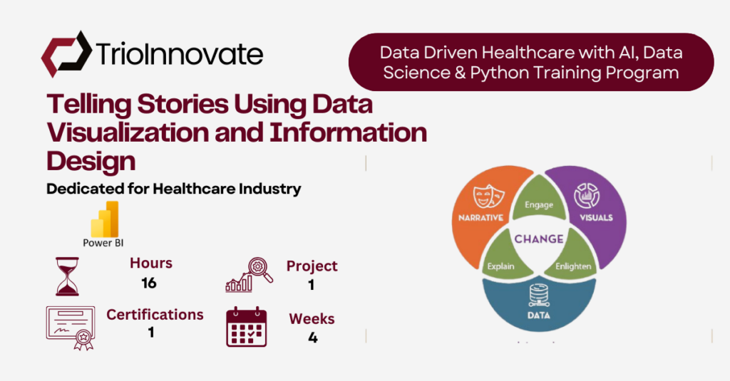
Course Duration:
4 Weeks (2 to 3 hours/ Week)
Prerequisite:
- Basic Statistics: Understanding of statistical concepts to interpret and visualize data accurately.
Design Principles: Familiarity with design fundamentals to create effective visualizations.
Technical Skills: Proficiency in relevant software tools or programming languages used in data visualization.
Earned Skills:
Python, Problem Solving, Supervised Learning Algorithms
Earn Certification:
Earned a valuable certificate to boost your resume